

Data Visualization Dashboards
Dashboard 1 - Job Placement Trends
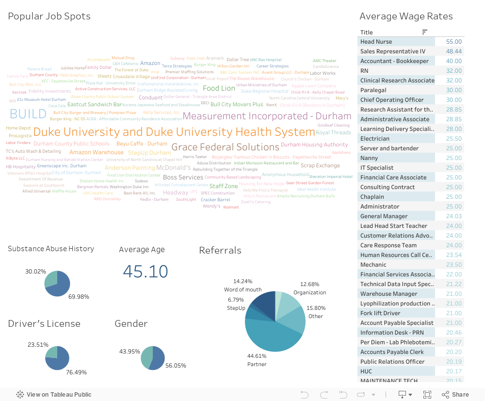
This dashboard provides insight into where StepUp Durham participants were employed after completing the program. The bottom section displays the names of locations where at least two participants were hired, with the size of the name indicating the number of StepUp Durham participants hired. Users can filter the dashboard based on location by clicking on an employer name. The blue dots on the scatter plots represent individuals with criminal records, while the green dots represent those without criminal records. Blue diamonds indicate individuals who have been previously incarcerated.
Dashboard 2 - Participant Demographics
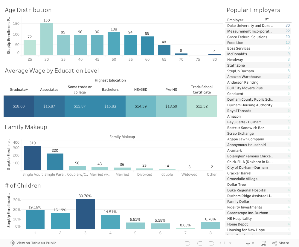
This dashboard showcases participant demographics, including education, family makeup, age, wage, and employers. Each category can be used as a filter to obtain more specific information. You can fill across multiple different panes, for example- if you wanted to see how many people were in the age range of 30-35, are married, and have 1 child, you could do this by clicking on respective graphs.
Dashboard 3 - Historical Hiring Trends
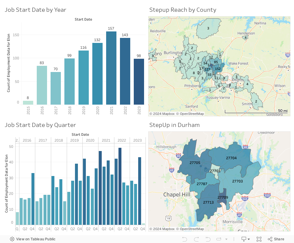
This dashboard provides a historical perspective on StepUp's impact since 2015, visualizing when StepUp participants were hired. This visualization includes age, wage, and other statistics such as driver's license possession and childcare availability. The historical data goes up to the beginning of September 2022.
We hope these dashboards provide you with a better understanding of StepUp Durham's impact on the community. Please explore and utilize the interactive features to gain deeper insights into the data.

Created in partnership with Elon University's Center for Organizational Analytics, these visualizations showcase the results of StepUp Durham's program participants who were able to successfully gain employment.